With the support from a USDA grant, Meld helped Field to Family build awareness and expand audience reach as a comprehensive regional food hub and online farmers market in Iowa. By deploying our full-service marketing services, Meld guided Field to Family by defining who they are today, elevating its brand identity, and building its audiences and personas. We also helped the nonprofit build its social media presence and created design templates to drive email marketing forward.
At its core, Field to Family’s mission is to increase access to and education around healthy and local food. It’s powered by growers and consumers who share a purpose to create a diverse, abundant, and regional food system so all people across Eastern Iowa can eat fresh food with the seasons.
Field to Family is a young organization that’s focus changed significantly over its first two years. They had expanded their services and who they serve, moved locations, and developed more programs working with growers, producers, partners, and schools. Meld offered guidance and firepower to get Field to Family’s marketing up to speed with the new realities of who they had become.
We started by helping the organization communicate what they do every day and how they make a difference in people’s lives. We created surveys for people in the organization so they could help provide the higher-level goals as well as the nuances of what makes the organization special. These survey responses were used to guide an open conversation that Meld calls Discovery, where the goal is to extract historical knowledge, aspirations, and pain points from the Field to Family team. The next step of Meld’s Discovery process was the Report Out, where Field to Family was presented with 10 specific recommendations across brand identity and positioning, consistent messaging, storytelling, and digital strategies centered around their greater goal of telling their story more efficiently and expanding their brand awareness.

Upon Meld’s introduction of their new brand concept, Field to Family’s Director, Michelle Kenyon had one reaction.
“I feel seen.”
Michelle Kenyon, Marketing Director
Field to Family
Meld began work conceptualizing a refreshed brand, including a logo, brand promise, and brand attributes, that better encapsulated Field to Family’s story, while having the ability to adapt and scale wherever it was used.
Multiple versions of Field to Family’s logo, the large color palette, and the intricate details made it difficult to apply to mediums like social media icons, merchandise, and more. Their tagline, “We Grow Local” didn’t fully capture the essence of Field to Family, which is serving and educating the community. Meld’s first task was creating a fresh look that accomplished the ability to remain distinctive and recognizable everywhere from the smallest settings to the largest while succinctly telling their story.
Before
After
Field To Family Icon
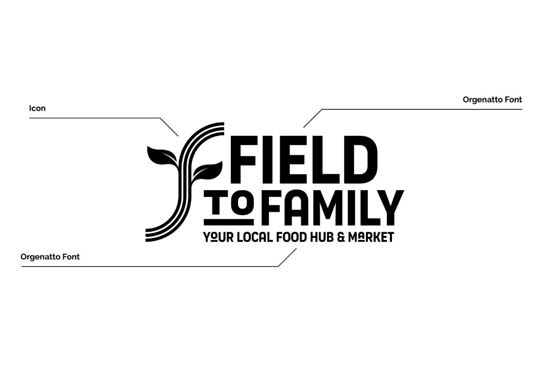
Field To Family Logo Construction
Field to Family’s new brand logo leans into the ‘f’s’ that represent the brand, in a simple, modern arc that symbolizes the paths of farming fields in a refreshing way. Meld describes some meanings as “coming out of the field; from a place of origin; on the move; the distribution of goods; roads to schools, families, consumers, growers; and even the three areas of Field to Family—a regional food hub, online farmers market, and their mission around education. The leaves in the new logo pay homage to the original logo in a fresh way, becoming more distinctive to audiences. The new color scheme represented the life cycle of produce, focusing on greens, yellows, and browns. This not only reflects the name but also creates an earthy and rich tone that would be expected of a food hub or online farmers market. The secondary palette includes shades of red, orange, and purple, resembling fruits and vegetables like strawberries, tomatoes, eggplants, and carrots.
When crafting a new tagline that refined their message, Meld wanted to make it easy for those unfamiliar with Field to Family to understand what they do. With a more inspirational name like Field to Family, we opted for a more descriptive tagline approach: Your Local Food Hub & Market. ‘Your’ connotes that something is direct to you. Local is obvious! Food Hub tells people that Field to Family’s core is food. The hub references something that isn’t always immediately understood but shows that Field to Family is something bigger. Finally, the market says “Oh, there’s also something I can visit or engage with directly in some way.”
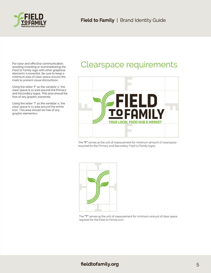
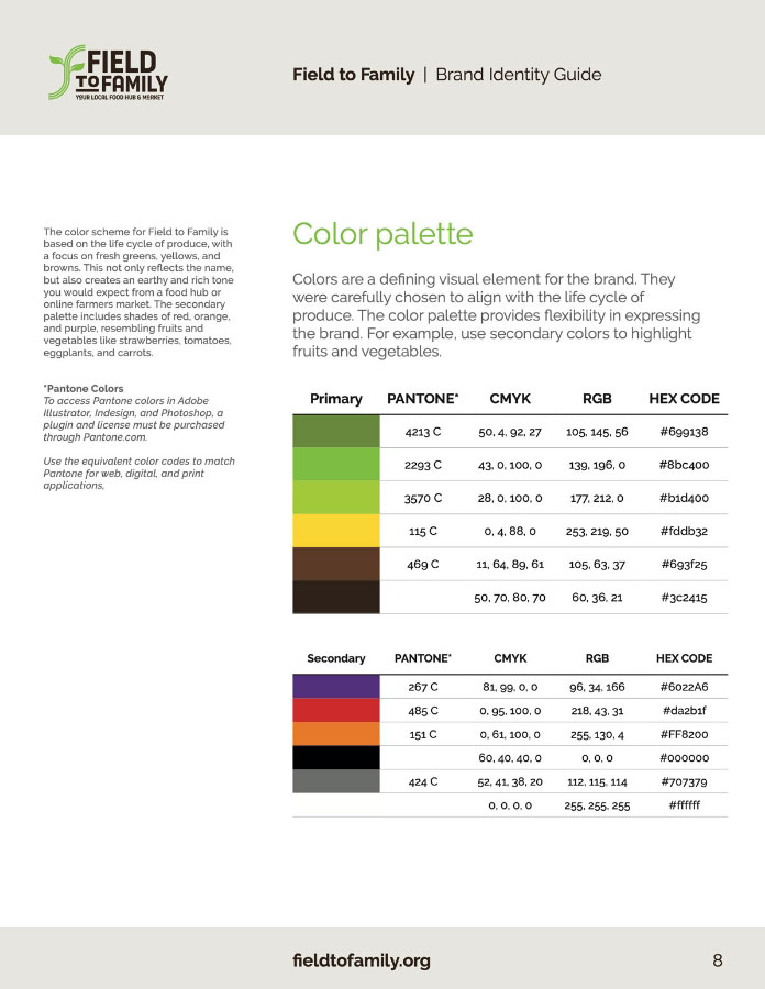
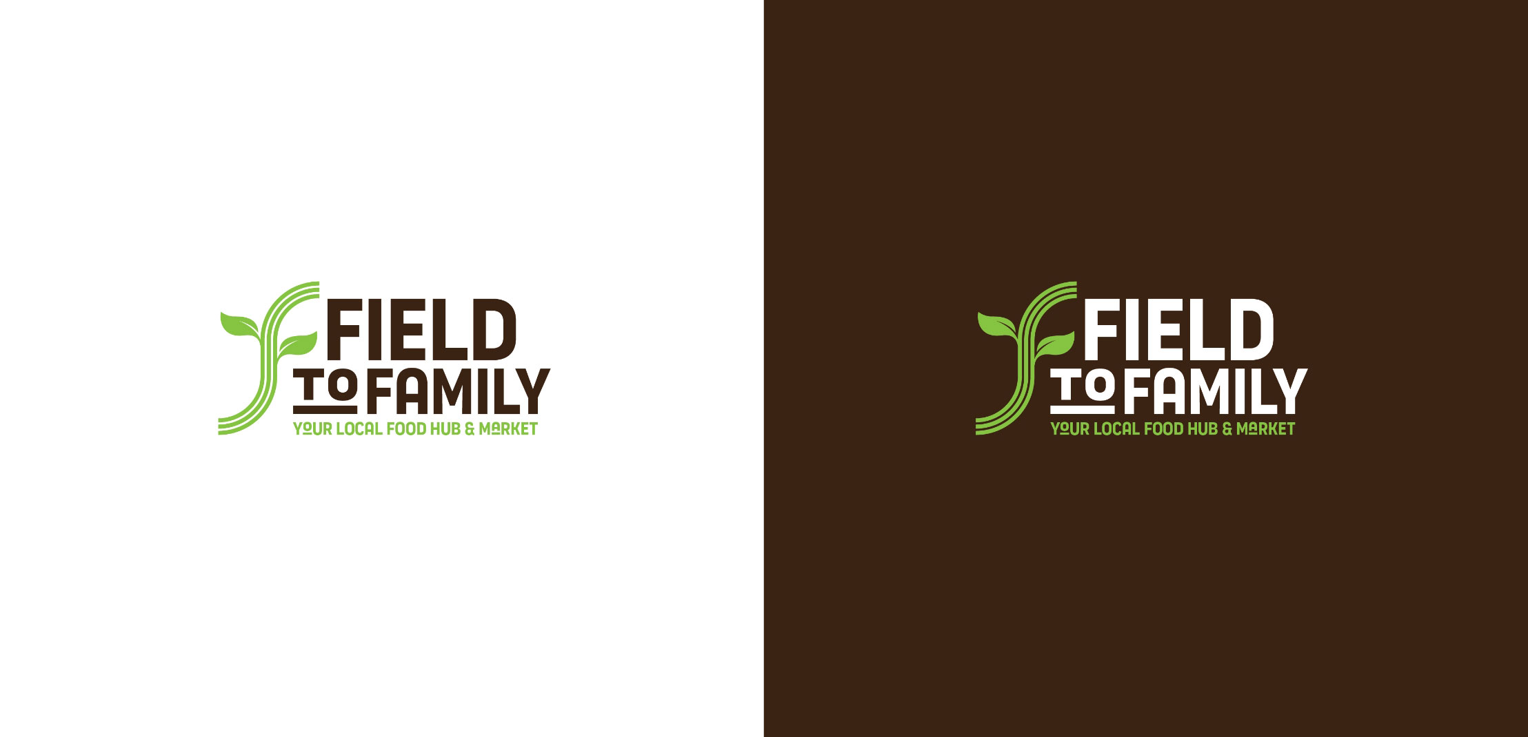
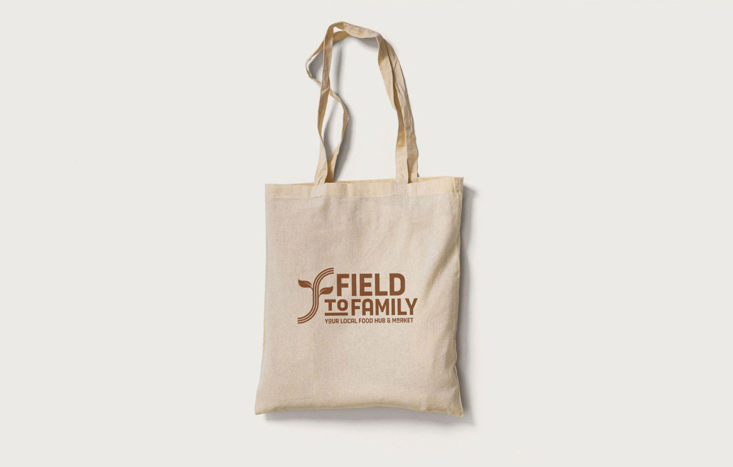
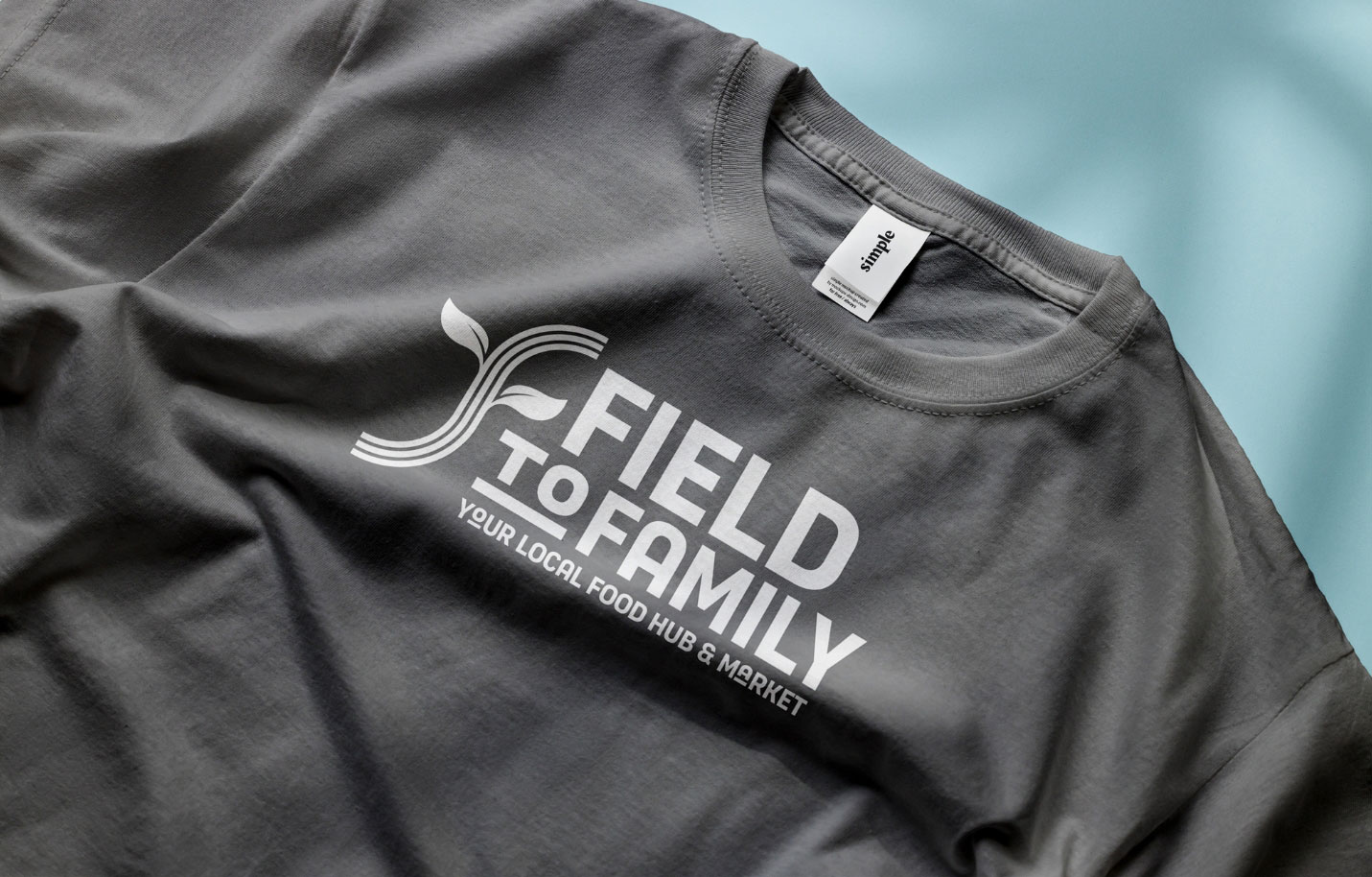


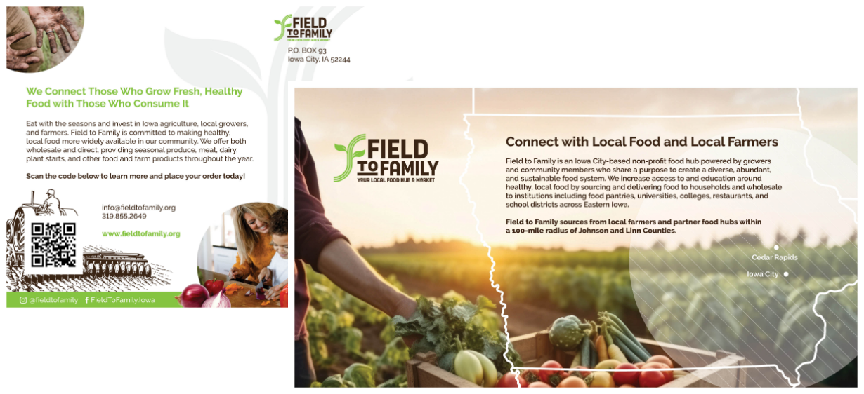
To aid in creating a smooth transition to the new brand, Meld created updated assets ranging from digital ads and social media to signage, email signatures, banners, and elements to create a branded environment in their new office location.
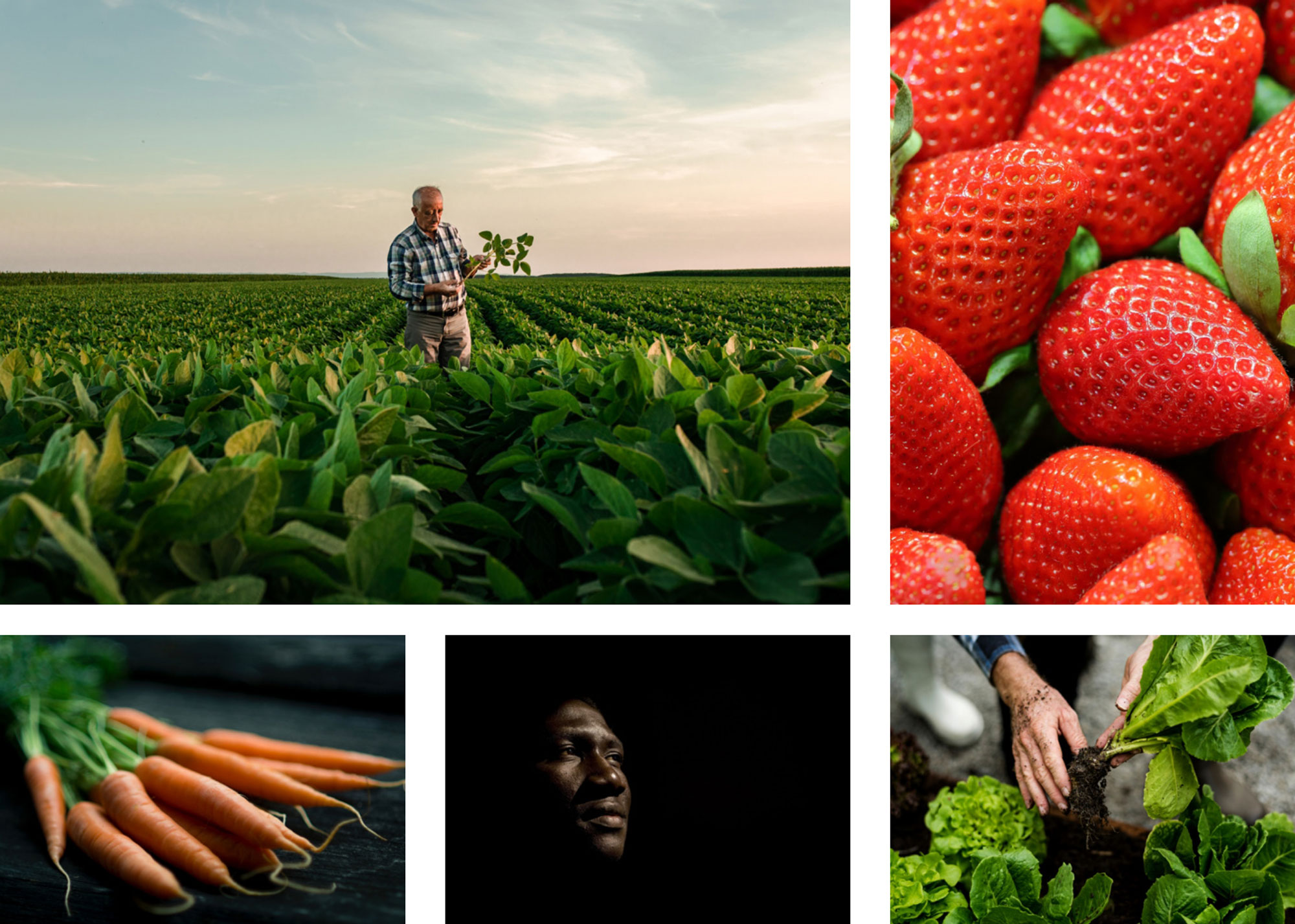
Effective communication of the Field to Family brand relies on beautiful and engaging photography. The brand and story were brought to life by telling the stories of farmers and our local community through vibrant photos of fields and growers, through students at school learning about where their food comes from, to following the seasonal journey of the fruits and vegetables that feed the region.


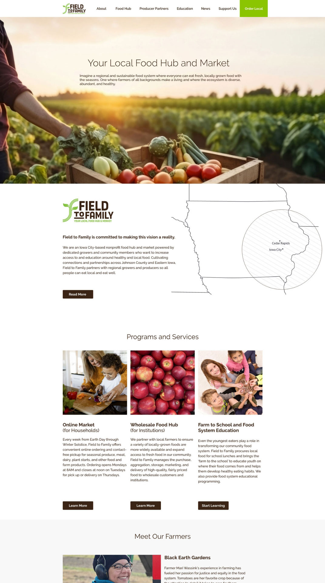
We also designed and created content for a new website, created PR as part of a coordinated launch, and developed a strategy to reintroduce the nonprofit to its audiences.
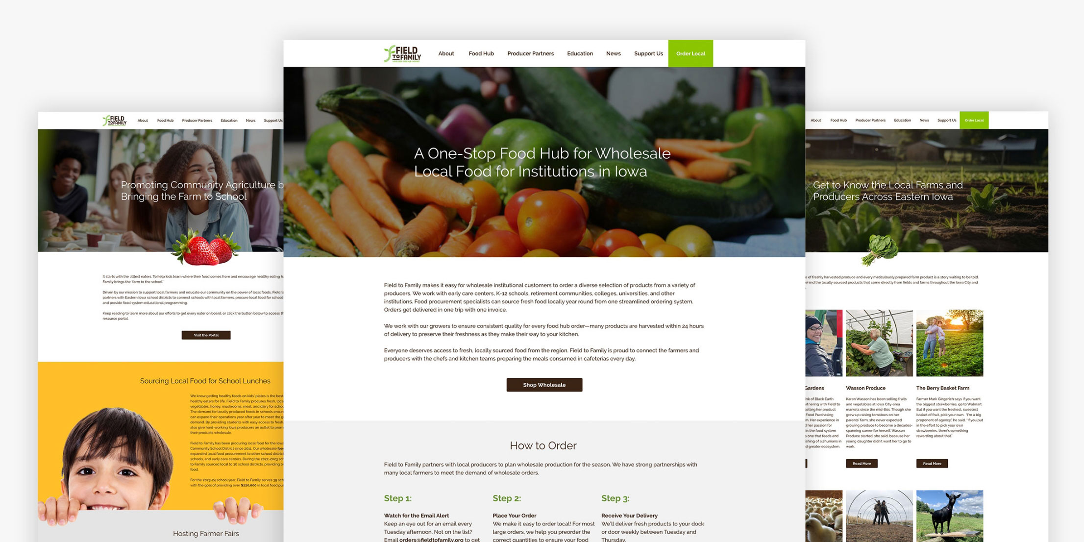
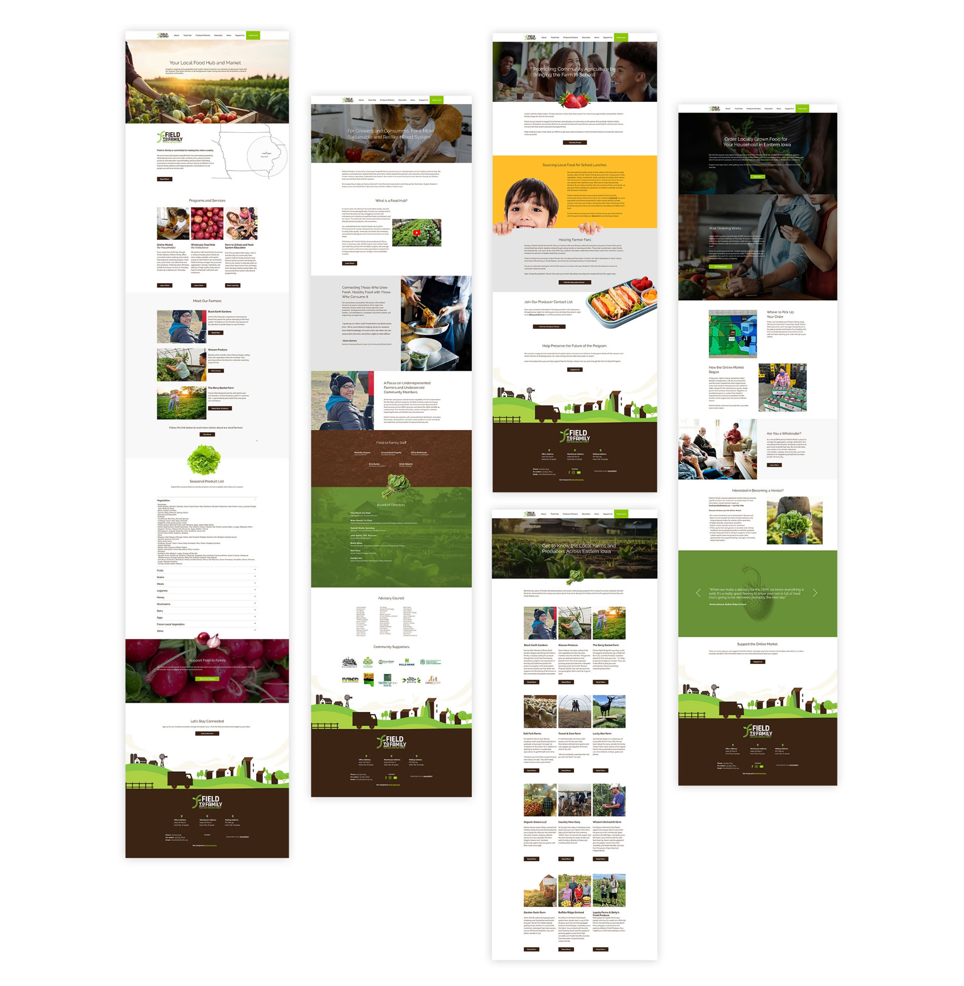
Meld often works with clients who have never been through a launch. We created and reviewed a “What to Expect for Launch” document that helped the entire organization understand how to reintroduce themselves and their brand to their audiences. In order to “warm the audience” up to a new brand, Meld’s process typically entails an 8-week launch that includes 3 parts: setting the scene (before), launching the new brand (during), and continuing education on the change (after). Typically done through social media, Meld created a content calendar for the Field to Family team and crafted posts specific to each launch period throughout the 8-week timeframe.
To ensure a coordinated launch across all mediums, Meld refined language and messaging which would be updated on Field to Family social media profiles. When launch day came, the Meld team pushed the updates live, posted the launch on Facebook and Instagram, and wrote and sent a press release to inform local news outlets of Field to Family’s new look.
The logo transition animation which officially unveiled Field to Family’s refreshed brand proved to be a hit with their audiences by garnering:
impressions on Facebook
For Field To Family
Discovery
Brand Identity
Brand Foundation
Tagline
Creative
Website
Site Map
Content
Design
Development
SEO
Photography
Strategy
Organic and Paid Social
Print Ads and Templates
Email Newsletter
Signage
Throughout the process, Meld was able to foster a strong understanding of the Field to Family team through multiple in-person meetings, brainstorms, and tours. These sessions along with a firsthand tour of their facilities as well as meeting their producers and customers, helped Meld gain a deeper understanding of the organization so we could drive their marketing to new levels.