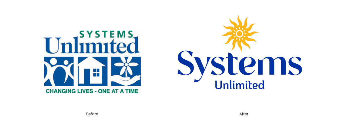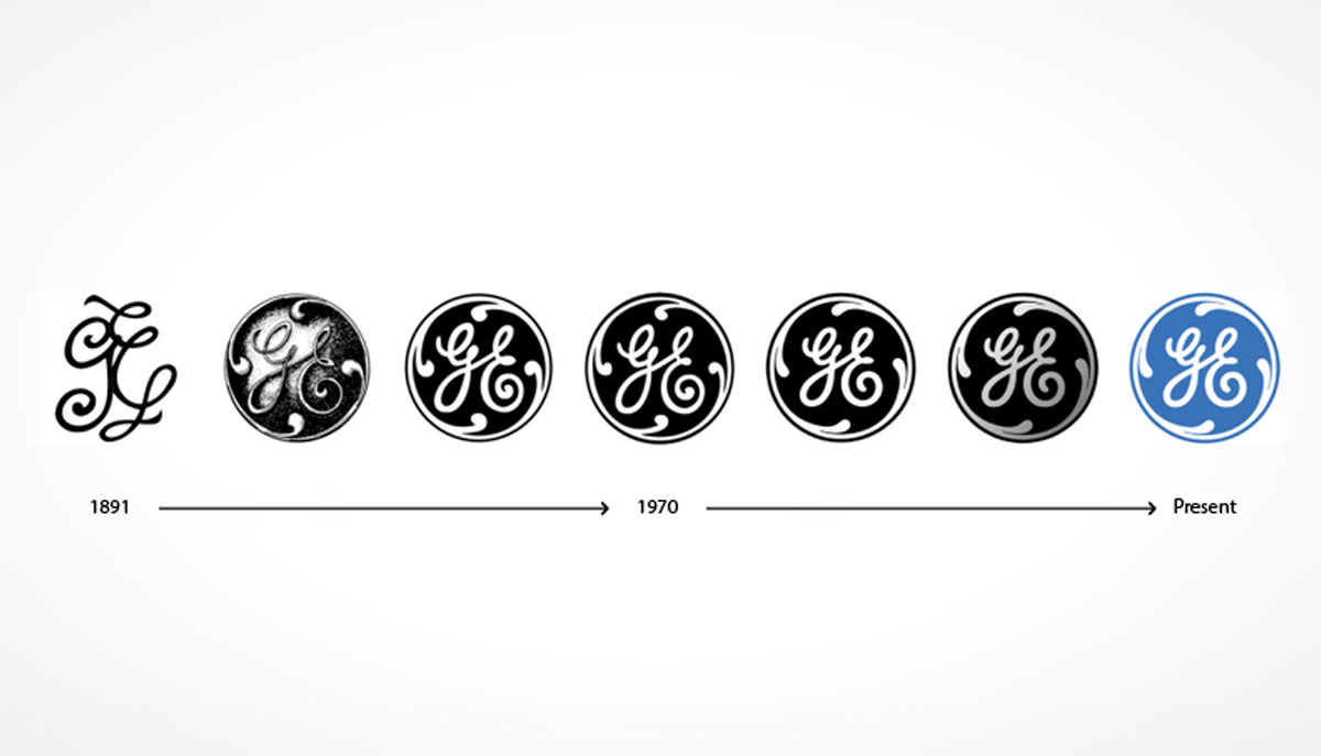
Logos simplification is nothing new. By taking a step back in history, you can see that logo designs were often simple hand-drawn monograms, as seen in General Electric’s 1891 logo. Iconic emblems like Mercedes Benz or shields like UPS are more traditional styles brands have used to identify and authenticate their offerings. With the advent of graphic design software in desktop computing, designers began to use tools that added gradients, embossing, and drop shadows to logo designs and a wealth of fonts to choose from.
Intricate and complex logo design began to level off with the rise of mobile devices in the late 2000s, with the popularity of the iPhone and smartphones. But with various mobile screen sizes and app-driven experiences, it’s now easy to see that detailed and intricate logos translated poorly to mobile screens. The more simplified the logo, the easier it is to recognize in smaller sizes. The trend toward simple, uncomplicated logos for mobile optimization continues to be a priority in logo design and is a critical component of a well-designed brand identity.
Any brand can have a beautifully designed logo, but if it’s not scalable and looks unrecognizable in today’s digital multi-screen world, your brand is losing valuable real estate, failing to distinguish itself from competitors, and missing out on the brand recognition that keeps it top of mind with your consumers. Remember that people transition daily between desktops, tablets, and mobile devices.
Iconic Responsive Logos
Many well-known brands have embraced responsive logo design. For instance, consider the simplicity and effectiveness of Coca-Cola, Chanel, Walt Disney, Kodak, and more recognizable brands. Each logo can be reduced to a symbol and still be recognizable even with words removed.
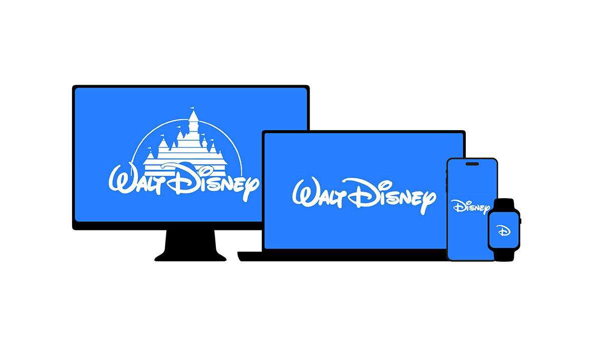
Take Walt Disney for example. Look at how the brand is able to reduce and transform the logo according to the various screen sizes. Designing a responsive logo is the strategy and art of creating multiple variations of your logo that adapt and scale seamlessly to different screen resolutions, sizes, surfaces, and devices. Whether your logo is a wordmark, using a stylized font, or a combination mark, combining brand mark with stylized text, either option should be identifiable as small as a favicon, the brand mark in the upper corner of the internet browser window—one of the smallest variations of a logo.
4 Reasons to Implement Responsive Logo Design
Having your logo translate across devices, platforms, and sizes offers benefits for your brand and your customers. Some of the top benefits include:
- Enhanced User Experiences: A responsive logo ensures a consistent and professional brand image, regardless of the device used, and ensures the brand is thought through at every touchpoint. Take the iconic Nike logo—no matter where you see it, whether on a shoe, or a jersey, everyone knows the swoosh, even if there are no words.
- Improved Brand Recognition: A clear and recognizable logo across platforms strengthens brand recall. Does your company have an app? A simple and effective logo should be easily identifiable amid other apps on phone screens. When driving down the road or in an airport terminal, familiarity with a restaurant logo can help identify a place to eat quickly.
- Adaptability to Future Trends: As technology continues to evolve, building a logo with the intention of being responsive means it can quickly adapt to new screen sizes and formats. Apple’s new Vision Pro and other wearable technology continue to define new spaces where logo integrity and scalability must be kept in mind. Thinking about fonts and their legibility is an essential element and another piece that plays a great role in these digital spaces.
- SEO Benefits: Search engines favor websites with optimal mobile experiences. A responsive logo can contribute to a better mobile-friendly score. Logos are always top of mind when bookmarking a website or saving pages to return to later. Additionally, a Google search of “Brewey’s near me” yields results with the logo showing in the upper left corner of each result returned. Additionally, your brand logo can become highly visible for tabs like frequently visited pages.
Simplicity Reigns Supreme
Simplicity reigns supreme in logo design. A tried and true mantra continues: the simpler the design, the better. A clean and minimalistic design scales down more effectively. The flexibility in the logo design is a byproduct of ensuring the logo is adaptable without compromising its core elements. A responsive logo typically works best with combination logos that include a brand mark or icon, the company’s name in a stylized font, and a tagline. As the logo scales down to smaller sizes, the core element of the logo remains. Over time, audiences can recognize the brand mark with no associated names.
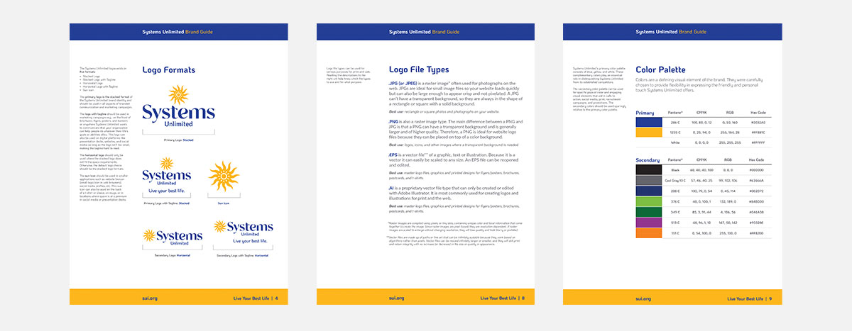
A thorough brand guide will clarify where each logo use is appropriate and will keep your brand consistent across all print, web, and digital while ensuring the logo variations are a unified visual language.
Meld’s Approach
When we design logos, we think about all the core elements and how the logo integrity is preserved across all sizes. With the various ways to approach logo designs, whether a wordmark only or a combination logo, the art, and strategy in empathizing, defining, ideating, prototyping, and testing. We think about how the logo performs in its smallest iteration and its full presentation. We take pride in ensuring the logo’s font is readable and that our clients’ logos look good in almost any scenario. In our usability testing for the websites we design, we test across devices, thoroughly testing logos on different devices, and screen resolutions remain optimal.
Do you need a responsive logo?
Responsive logo design is necessary for any business or brand to thrive in this ever-evolving multi-surface, print, and especially digital age. Investing in a responsive logo can actually even yield ROI by enhancing your brand’s visibility, improving user experiences, and future-proofing your visual identity to future technology and screen sizes.
Hometown Restyling
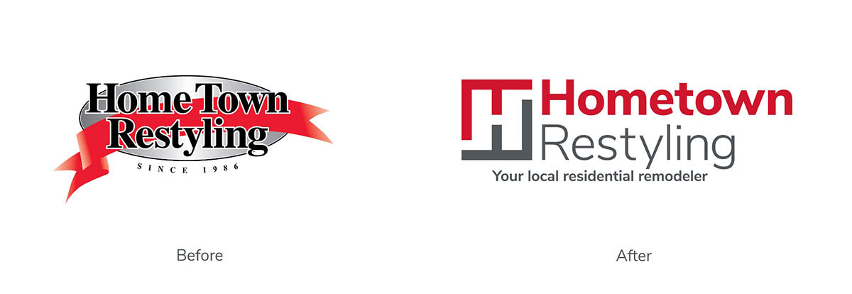
One of our favorite rebrands was Hometown Restyling. The old logo identity was not responsive and gradients were difficult to replicate across trucks, t-shirts, and signage. The new logo uses an “H” blueprint to show how the company takes its customers on a proven path from start to finish for every project—from windows, doors, and siding to sunrooms, patio covers, decks, kitchens, and bathrooms. The logo reflects the fact that the Hometown Restyling team is guiding you through the journey at every step. The tagline now lets potential customers know exactly what the company does. The logo is flexible across all touchpoints on the web, printed one-sheets, t-shirts, hats, trucks, and more.

Check out the rest of Hometown Restyling’s brand refresh here. Reach out to Meld today to talk about how you can take your brand to the next level with a responsive logo.
