An inside look at Meld Senior Graphic Designer Nate Collins’ brand identity work with Ray Orthodontics.
For Nate, it all started with a routine dental check-up… His dentist, Shawn Ray, mentioned that his wife Alison Ray, was opening an orthodontist office in Cedar Rapids, Iowa, and would need a brand identity and website. Nate told Shawn he’d recently joined Meld Marketing, a brand agency in Coralville, Iowa, that specializes in customized marketing strategy, brand development, and digital engagement. Alison reached out to Meld a couple of weeks later to set up an initial consultation.
During that first discussion, Alison mentioned she was talking with a couple of out-of-state agencies, specifically one that specialized in orthodontic branding. She knew someone who had used the national agency, but she also knew that she wanted to see what a local creative group could offer. We quickly discovered that members of the Meld team and Alison had several mutual acquaintances. We also had an undeniable synergy and passion for pursuing a customized brand identity for Ray Orthodontics.
The Meld team met with Alison and Shawn in January 2020 for a 2-hour discovery session. In discovery, we evaluated the local and national landscape, assessing other orthodontics and dentist brand identities, listened to Alison’s vision, the services she would offer, her brand aspirations, and discussed our strategy.
With each meeting, more and more of Alison’s personality came through — and that started to inform the brand. Alison is very down-to-earth and engaging. We quickly learned that she is an avid sports fan, plays softball, and coached youth sports. She wanted to see a logo that could translate to athletic apparel beyond scrubs, such as hats and t-shirts for sponsoring sports events. But it was her passion for orthodontics and for her patients that was undeniable. In fact, she said (and we quote):
“It’s so fun to move teeth, everybody should do it.”
Research and Ideation
We knew the name — Ray Orthodontics. Nate started to research orthodontic and dentist brand identities. It quickly became clear that most take their logos literally, using either a tooth, braces, or a smile similar to Amazon.
As we brainstormed, initially our team thought a stylized signature would convey Alison’s personal touch and the attention to detail she delivers to each one of her patients. But because of signage considerations in lighting, scale, and visibility, this did not seem like a viable path.
Nate discovered that when used in association with the word “Ray,” most script fonts started to resemble Ray-Ban, the sunglasses brand. He also found that most sans serif fonts lacked personality if not paired with a logo or icon. Knowing that the office, which was being built for Ray Orthodontics adjacent to Westdale Mall, would be part of a larger retail landscape with movie theaters, restaurants, apartments, and department stores, ultimately informed the design process.
This brand identity would need to be highly visible from the street, but not confuse consumers. In other words, it needed to be designed so it in no way could visually be confused with either Ray-Ban or an optometry or eyeglass store at first glance.
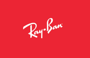
Ray-Ban Identity
Next, we turned to the Branded from Memory study to remind ourselves of best practices and consumer behavior. We know consumers can generally recreate iconic logos through a quick sketch. Most of them, even if they are a bit off, are still recognizable. Take a look at the sketches below for Adidas, Starbucks, and Dominos.
The takeaway from this review for Nate and our team was that a stand-alone logo or icon was not the path to take. Nate believed he could achieve a successful wordmark identity by focusing on the three letters – RAY. The name was short and simple and could create a versatile brand identity, but not restrict it to a stereotypical logo or icon.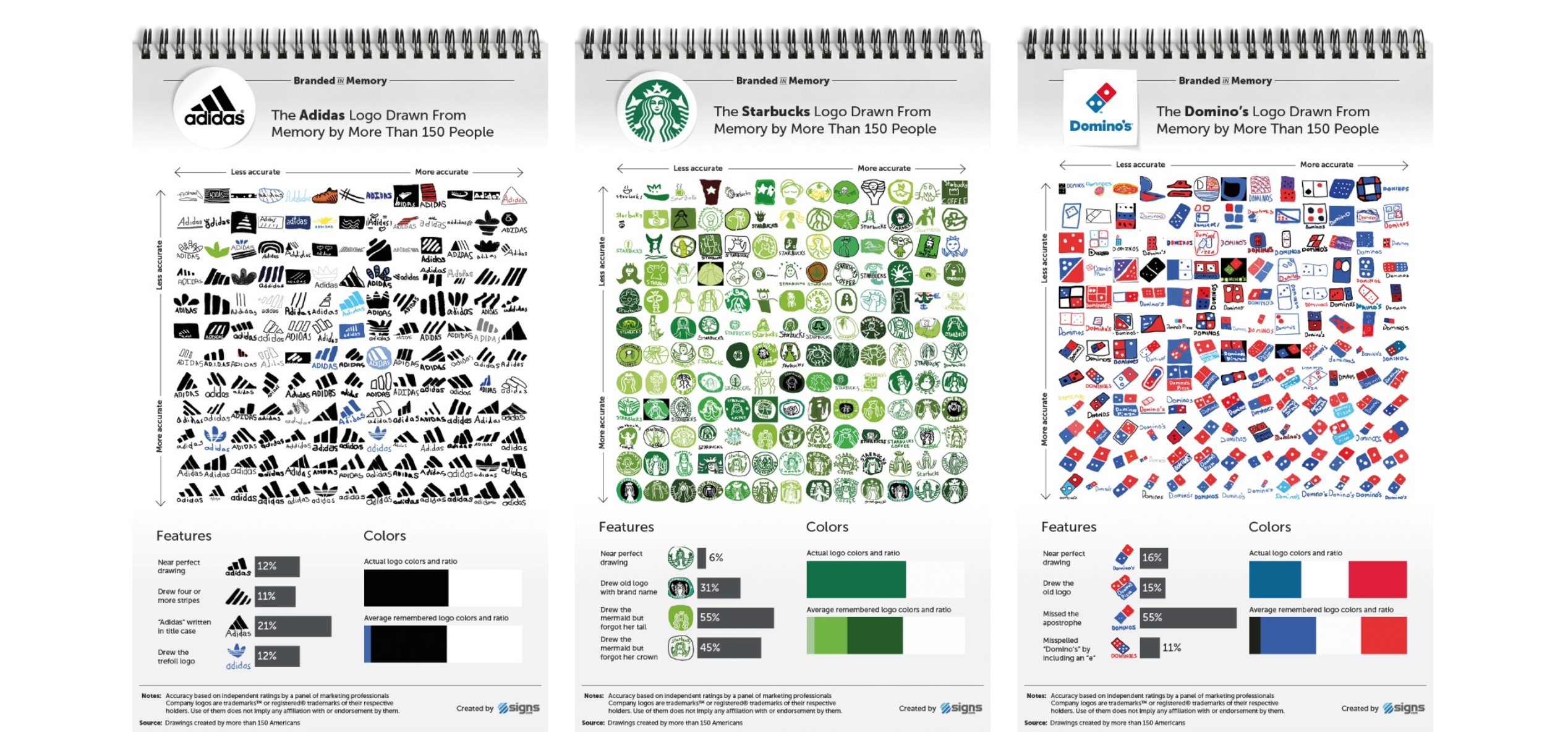
Images from signs.com
Finding a Font: When You Know, You Know
When Nate found Orborn, it was one of the most immediate match-made-in-heaven moments in his design career. Orborn’s round geometric shapes are specifically developed to be suitable for logos, headlines, and titles. The futuristic aesthetic gives Ray Orthodontics a clean and modern identity and effortlessly delivers a clear association with orthodontics and dentistry.
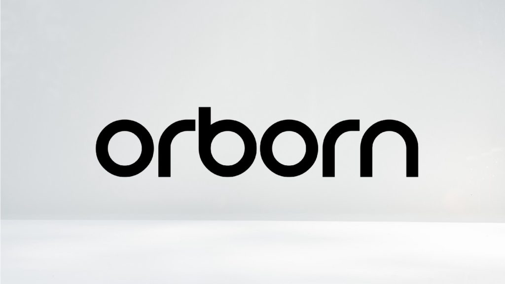
Orborn – Round Futuristic Font
![]()
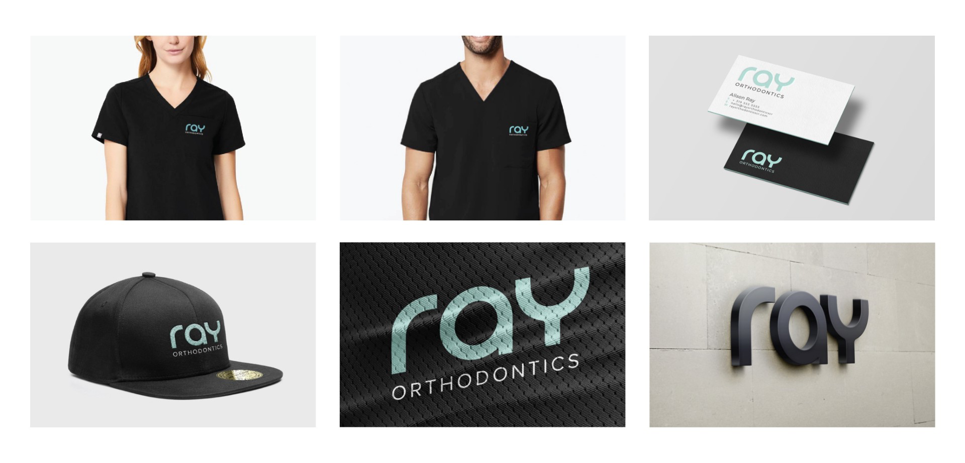
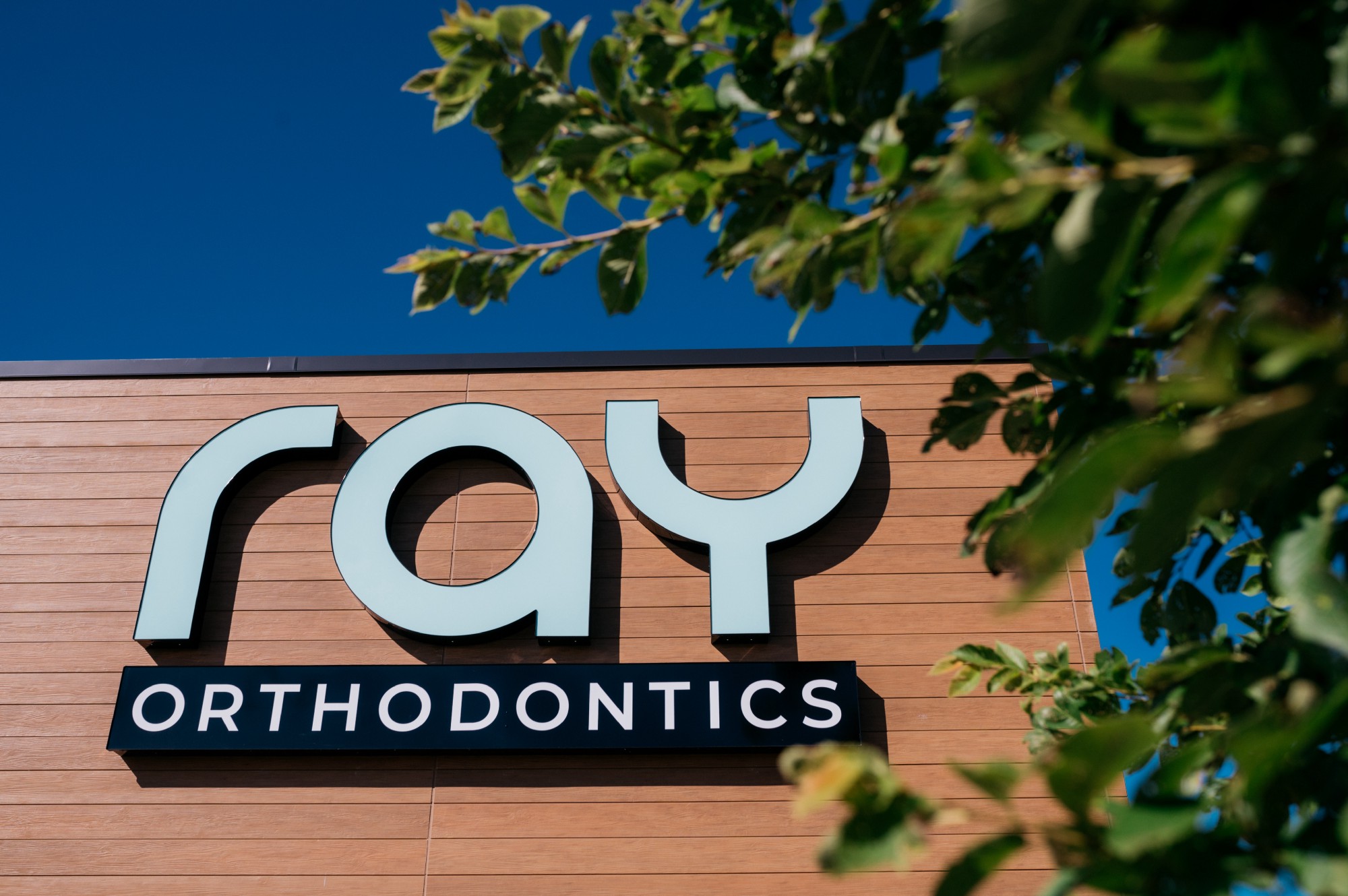
Ray Orthodontics Wordmark Logo
The ‘r’ portrays alignment and the tools of the trade used in orthodontics and dentistry. The ‘a’ speaks to the holistic journey of walking through the door with personal care each step of the way. The ‘y’ is the classic dental mold to take impressions but also hints at the smile all patients will come to love during and after their treatment. The identity delivers:
- A recognizable 3 letter wordmark identity
- A professional and athletic aesthetic that anyone could wear when applied to scrubs, hats, and t-shirts
- A clean, modern wordmark that speaks to orthodontics
Nate paired Orborn with Montserrat as the secondary font, giving Ray the flexibility to utilize the 18 weights to give hierarchy for both print and digital communication. Orborn carries unique font characteristics. Its use beyond the logo is to be limited, allowing ‘Ray’ to stand on its own in branding.
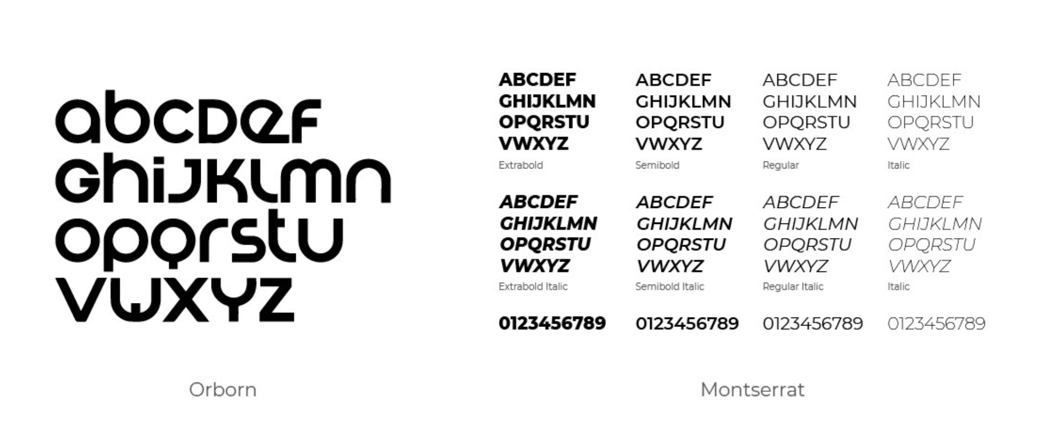
Orborn and Montserrat
Creative Expression
As trust began to grow between the Meld team and Alison, she asked us to consult on her interior finishes. Meld is lucky enough to have not only graphic designers and writers on staff, but also our VP for Client Relations, Michelle Johnson, who earned a degree in interior design. While Michelle doesn’t use those skill sets everyday, she often helps clients bridge the gap between their brand identity and their branded environment.
Early in the process, Nate, Michelle, and the Meld team asked Alison about her plans for Ray’s interior finishes. The colors she favored aligned well with a color palette Meld had presented as a strong way to differentiate her business in the local area. Together, Alison and Meld settled on a seafoam green, black, gray, and white color palette.
Read more about what to consider when choosing a color for a new brand or logo.
The seafoam green compliments the black, giving bold and eye-catching branded items when applied to apparel like hats and t-shirts. The font also delivers distinct signage in the Westdale Mall landscape.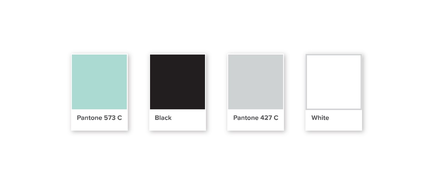
Color Palette
Creative Concepts
Smiles For Everyone
Ray Orthodontics opened in May 2020 amid COVID-19. Despite such an uncertain time, Alison routinely commented on the fact that she had earned several new patients from the brand identity alone.
“Choosing Meld to create the logo and branding for our new business was the best decision we’ve ever made! We’ve received so many positive comments on the logo from customers, and it’s helped to draw in new customers as well.”
Alison loves the statement “you’re never fully dressed without a smile.” She loves what she does: giving people award-winning smiles. Working with passionate people like Alison was rewarding in itself. And delivering a unique brand identity that came together with synergy and strategy left us all wearing a big smile.
Beyond the Branding: The Finished Product
Of course, the branding doesn’t stop at the signage and scrubs. Alison used the logo as inspiration for the interior finishes of the Ray office, creating a cohesive branded environment. To learn more about building branded environments check out this Meld blog:
Designing Branded Environments with Tallgrass Business Resources.
To see more of the Ray Orthodontics branding, check out the photos below or visit Ray Orthodontics’ website (also designed by Meld).
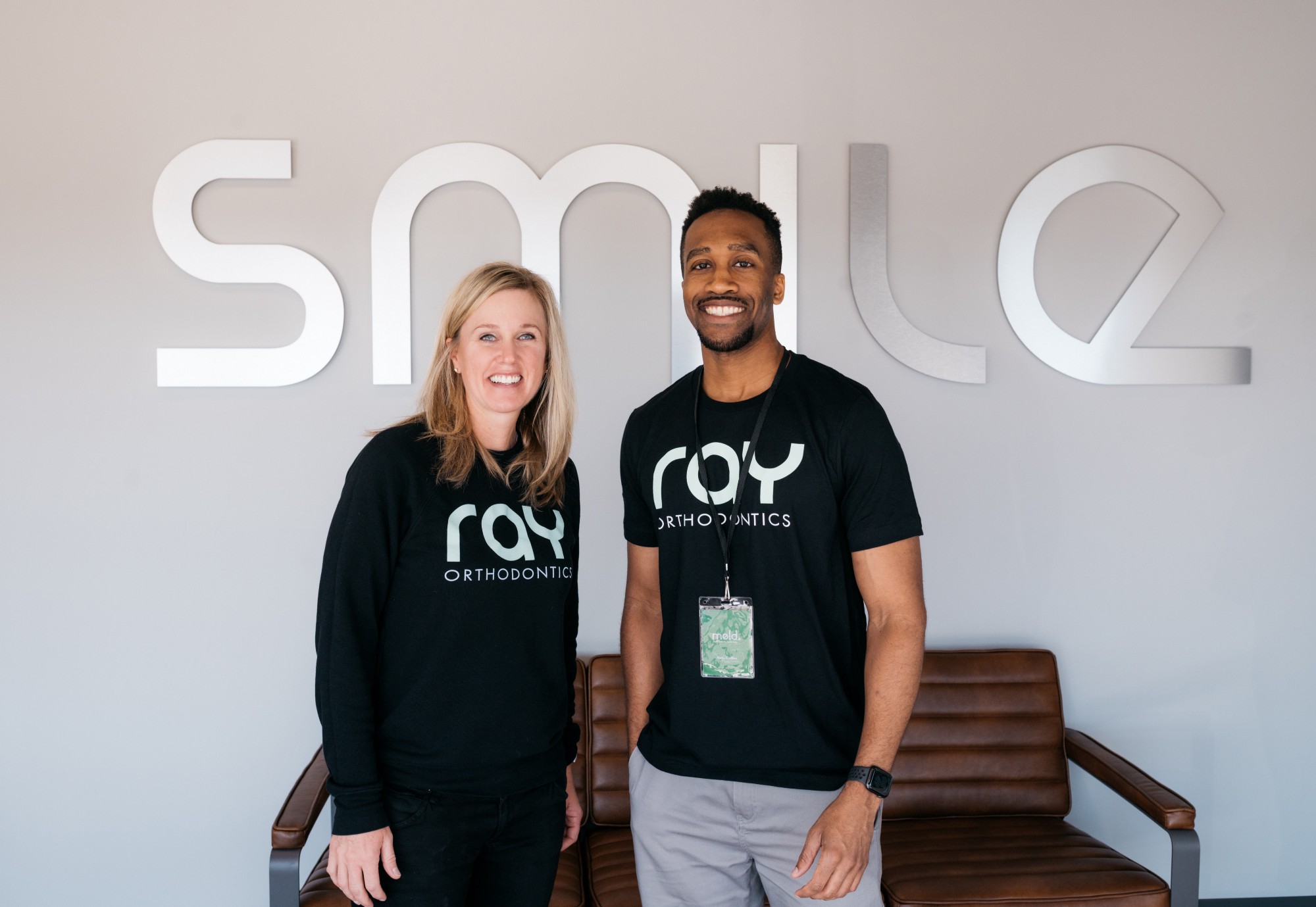
Dr. Alison Ray, DDS, MS, and Nate Collins, Senior Graphic Designer
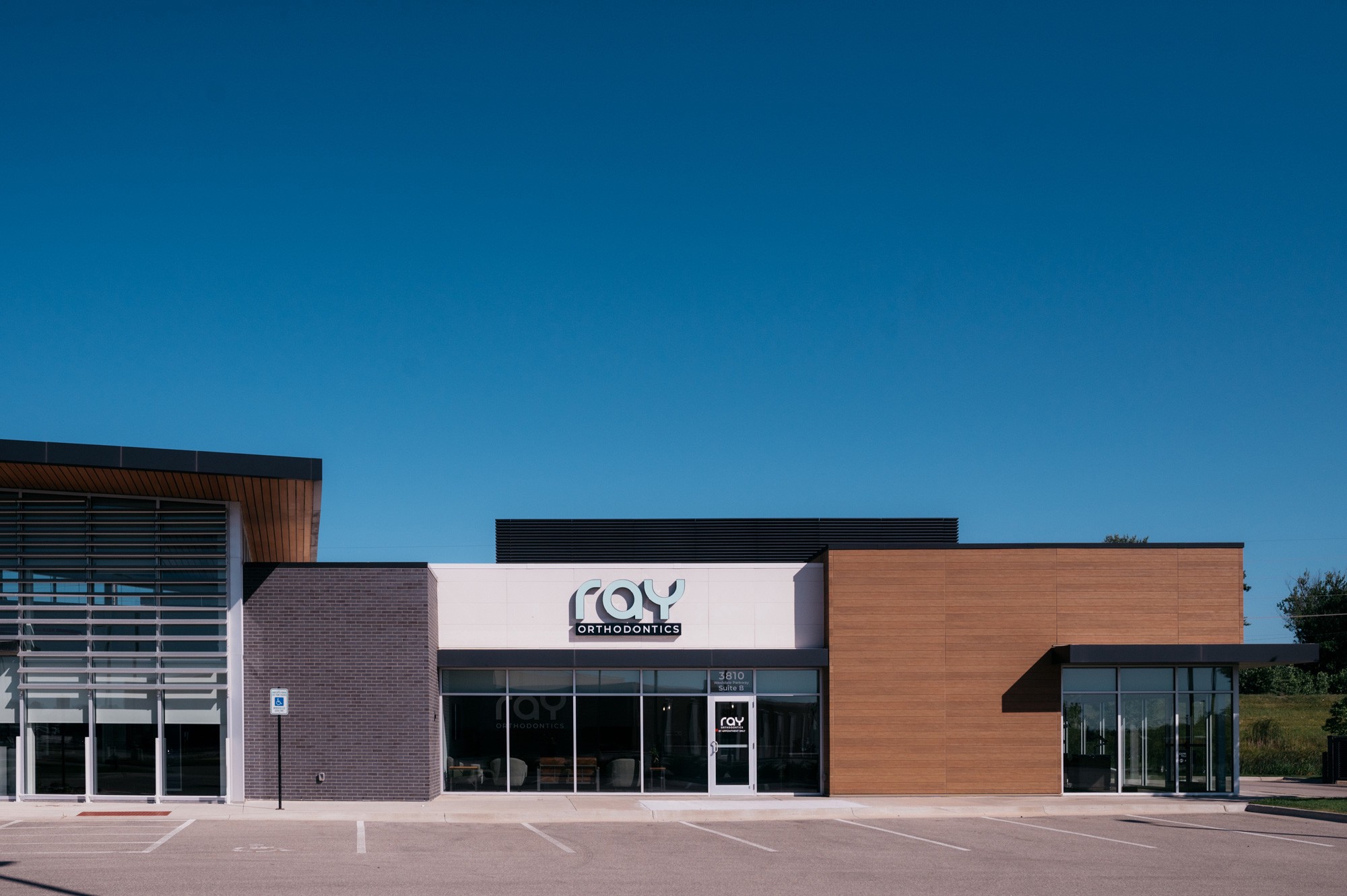
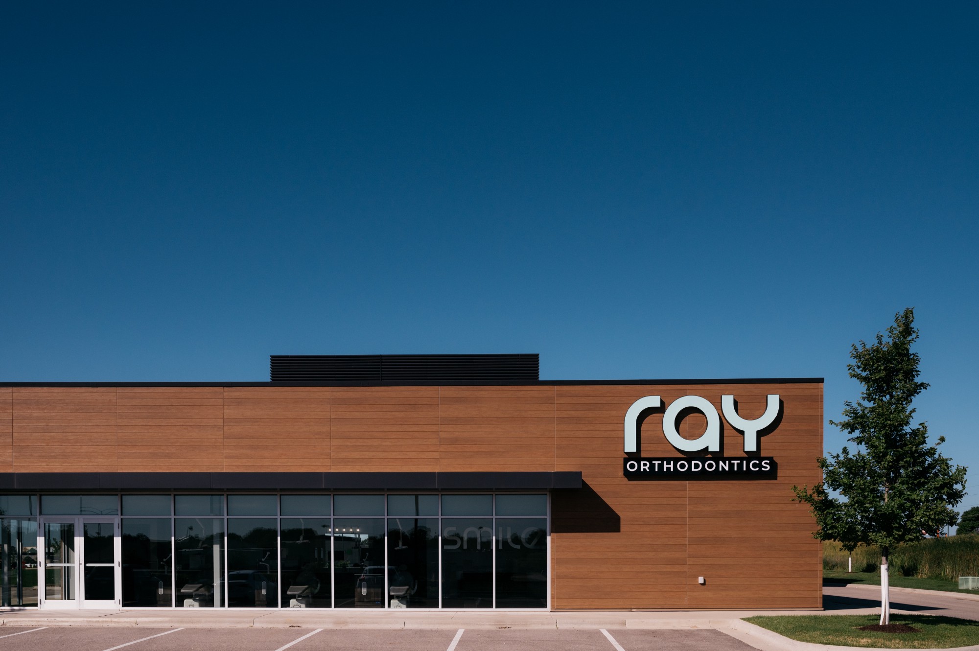
Ray Orthodontics Exterior
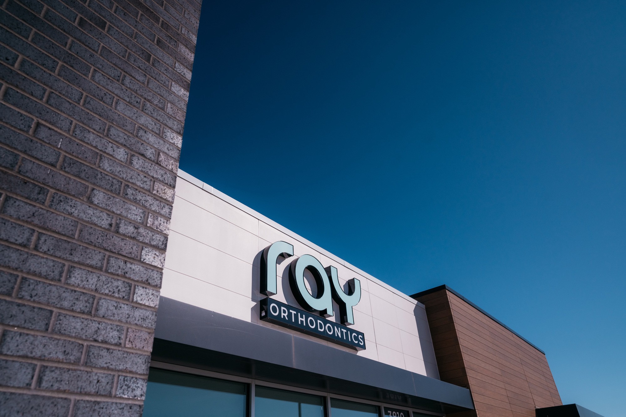
Ray Orthodontics Signage
North Exterior Signage
North Exterior Signage
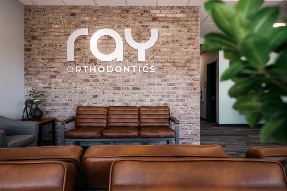
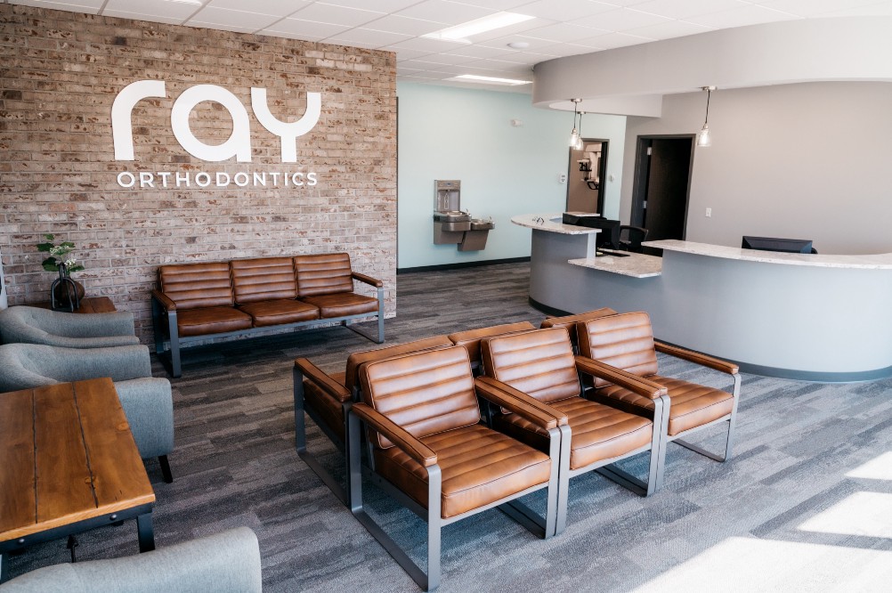
Ray Orthodontics Lobby
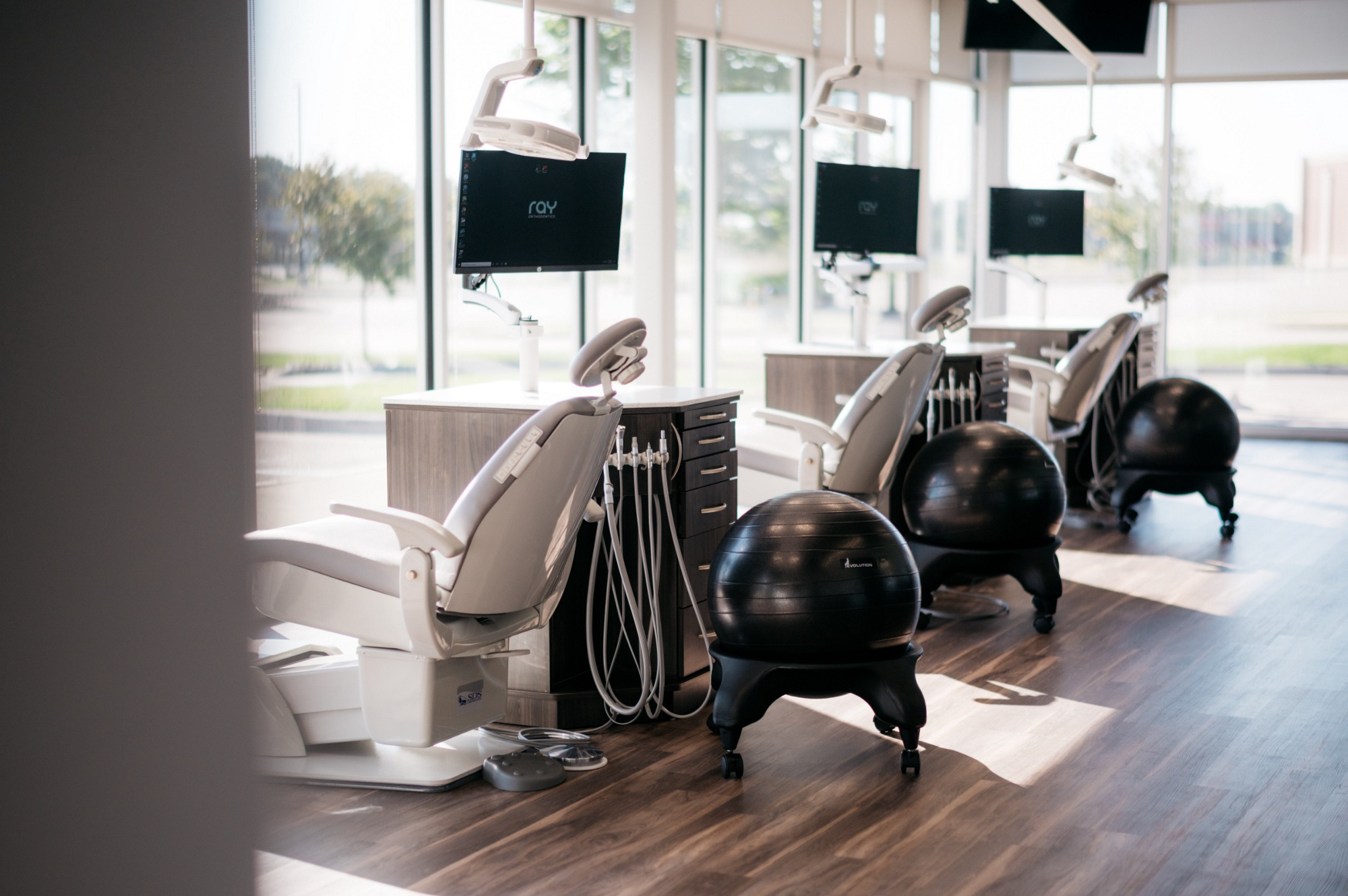
Ray Orthodontics Patient Area
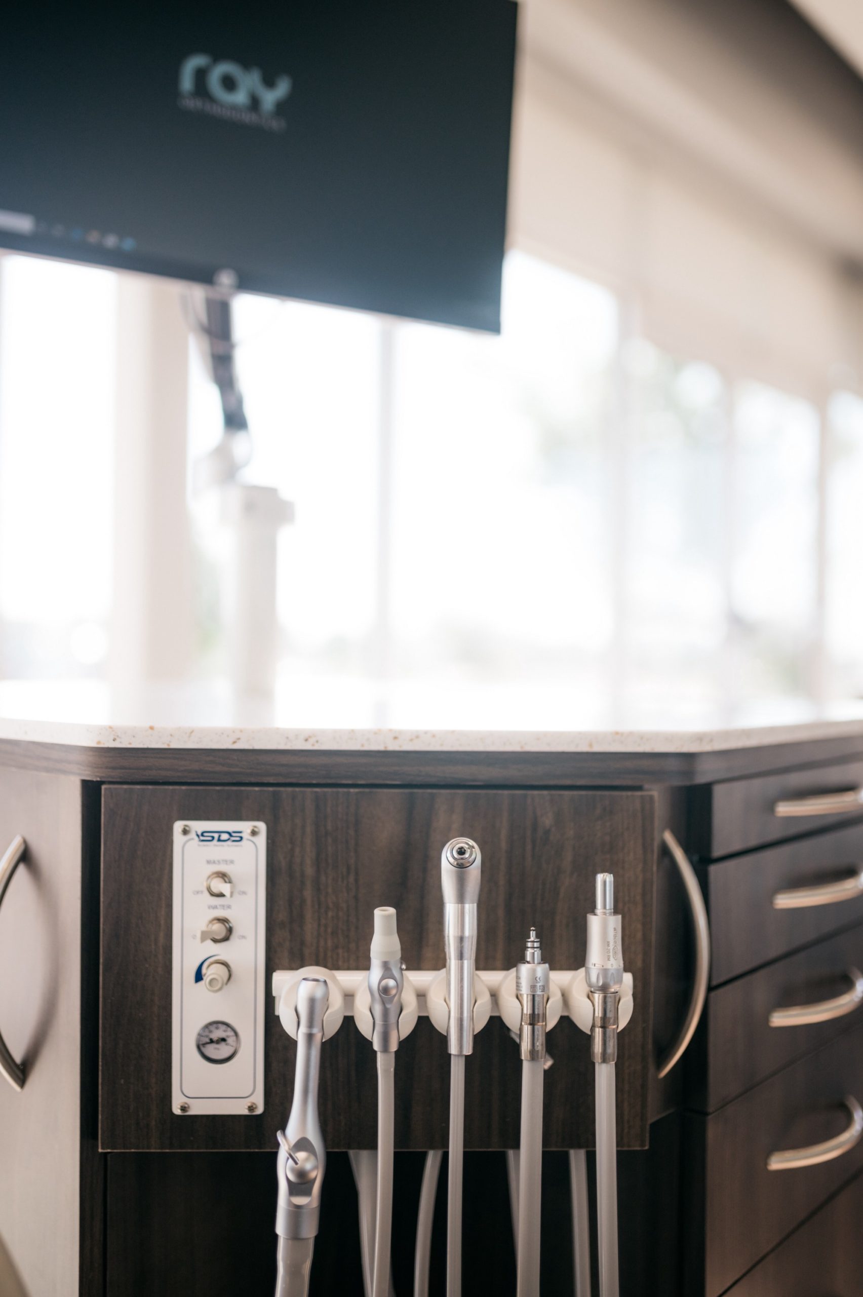
Orthodontic Instruments
Smile signage
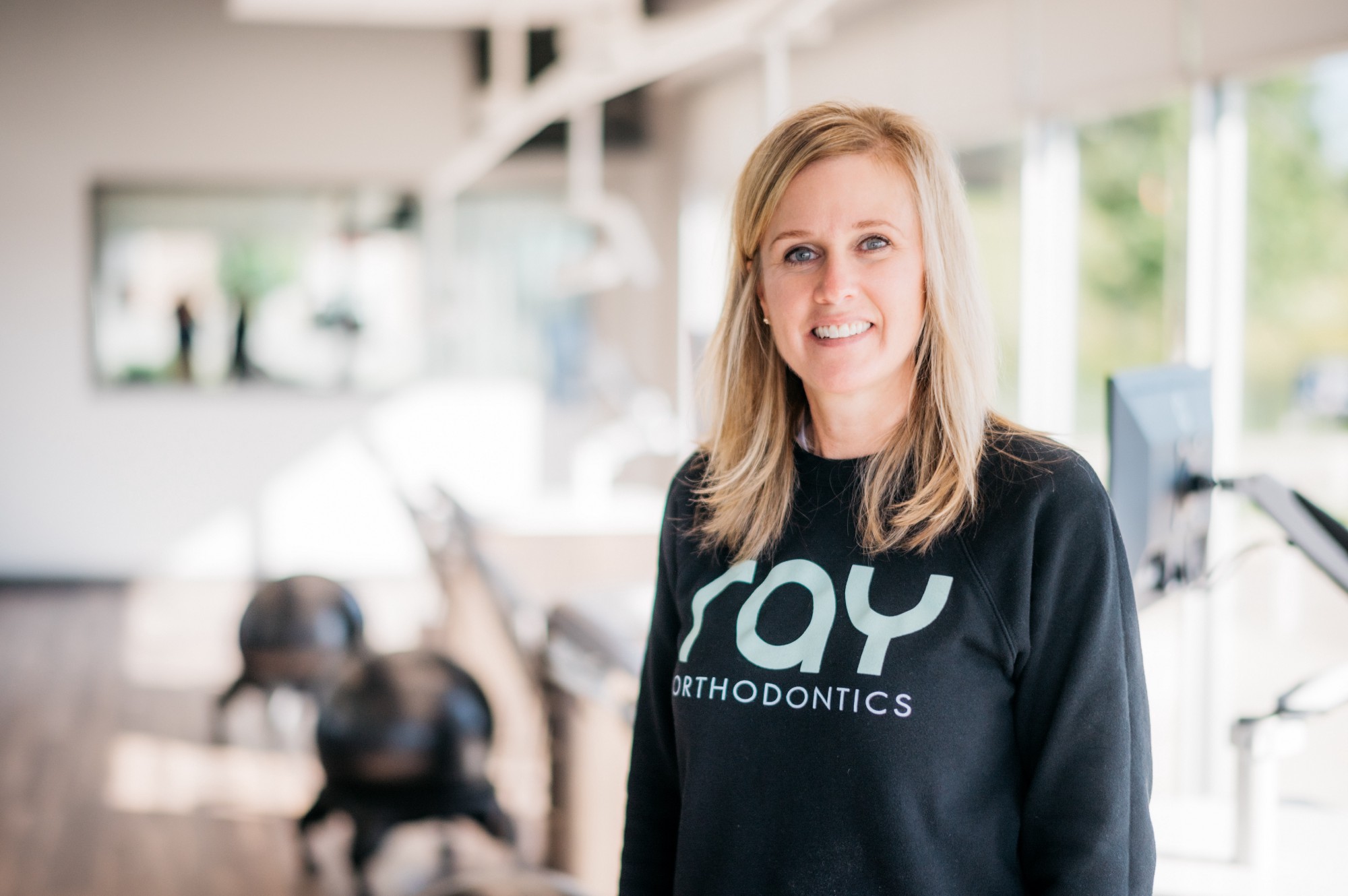
Dr. Alison Ray, DDS, MS
Starting a new business and need a logo and brand identity created? Want to refresh your existing logo? Reach out, and let’s talk!